Arkitech: Visual identity

Arkitech is an innovative Progressive House duo coming from Vancouver, Canada. So far they have been the author of many massive records, supported by names like Hardwell and signed on the Armada Music group. Their visual identity focuses its colors around red and pink mixed with black and white elements based on a fake 3D effect. You can also consult the page dedicated to their logo here.

Arkitech’s Facebook cover picture
Facebook Cover1
Arkitech’s Facebook profile pictures
FB Profile pic1 Arkitech Logo FX (Black BG)1
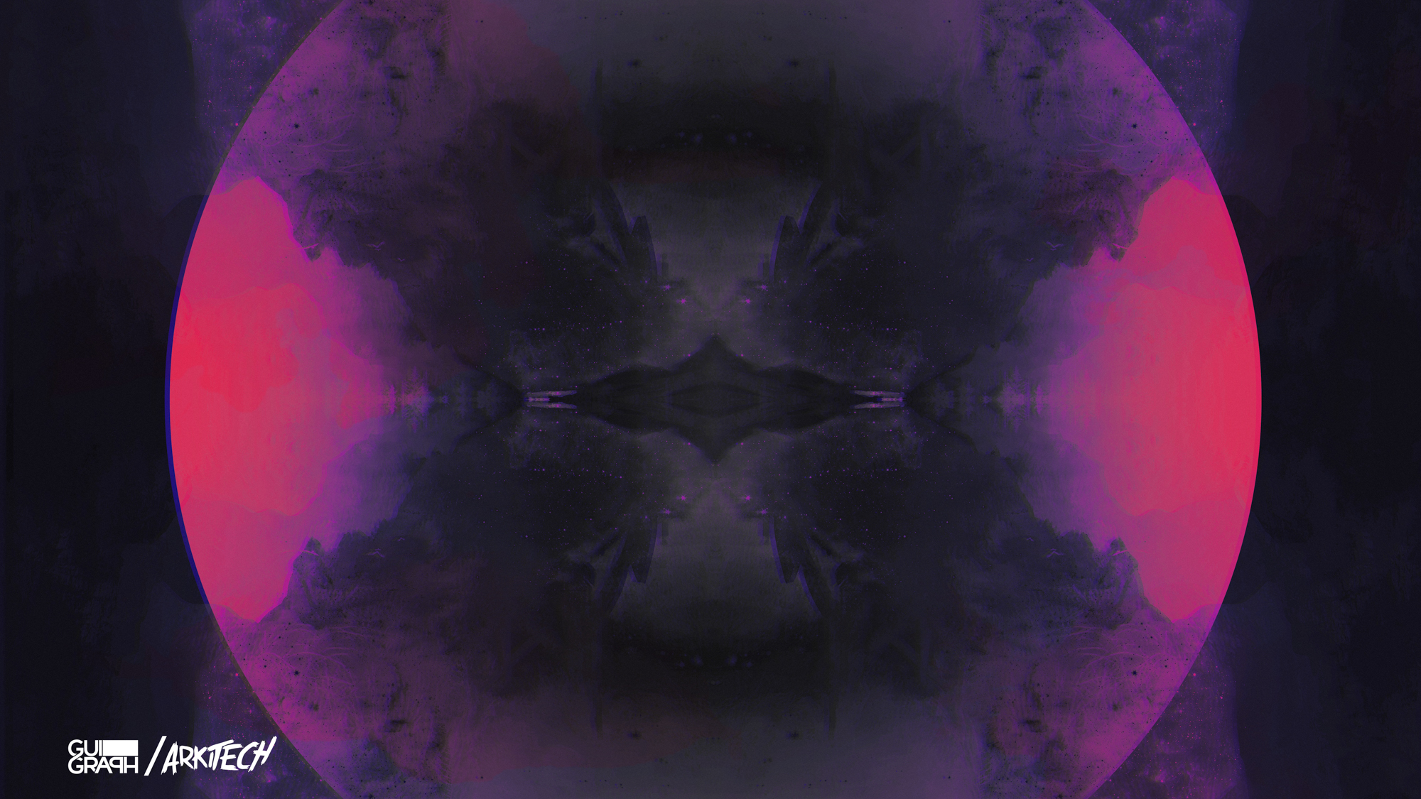
Wallpaper — Download here (13.71 Mo)
Wallpaper Signed1-2

More about Arkitech
Facebook — SoundCloud

Arccy: Visual identity

Arccy is another young French DJ/producer, and also Pendom‘s collaborator. The duo asked for a common visual identity, the graphics for Arccy therefore follow Pendom’s, with a blue color.

Arccy’s Facebook cover picture
Arccy Couverture Facebook
Arccy’s Facebook profile picture
Arccy Profile
Wallpaper — Download here (13.32 Mo)
Arccy Wallpaper Computer1

More about Arccy
Facebook — SoundCloud

Pendom: Visual identity

The 19-year-old French DJ/producer Pendom is my first logo and visual identity since the website’s launch! The fatness of his records gave me the idea of this logo, with a bloody abstract design inspired by his music’s dirty side. Click on the pictures to expand them! (Links to his pages are below.)

Pendom’s Facebook cover picture
Pendom Facebook cover1
Pendom’s Facebook profile picture
Pendom FB profile1
Wallpaper — Download here (13.24 Mo)
Pendom Wallpaper Computer1

More about Pendom
Facebook — SoundCloud

Mosvil: Visual identity

The ‘Chill House’ producer Mosvil describes himself as ‘a Swiss electronic music producer looking for his place in society’. The project’s philosophy is to make a step out of the usual 128 sounds of EDM and redefine Progressive sounds at a lower BPM. The logo therefore draws its inspiration from the three RBG layers used to symbolize this entire separation and redefinition. And the cover design keeps some familiar elements from the biggest labels in the industry, ending up in a conventional visual identity defining the new state of Progressive sounds, called ‘Chill House’. Here is the result (from the newest to the oldest).

04 Tri Martolod1 03 Alors On Danse1
02 Summertime1 01 Colors1

More about Mosvil
Facebook — Twitter — SoundCloud

Worka Tune: Visual identity

Worka Tune Records is a French record label dedicated to finding young and talented Electronic music producers. They have succeeded in discovering some, now signed on bigger labels like Aevion (Spinnin’), LarsM (Armada), Waysons (Revealed), Kastra (Hussle) and RetroVision (Reepublic).

~ 2015 ~
01 Logo 2015 02 Dark Side Of Your Heart Cover

~ 2013 and 2014 ~
03 Logo 2013-2014 08 Nothing To Say Cover
07 Faon Cover 06 Here To Stay EP Cover
05 Last Dance Cover 04 Ethnic Cover

More about Worka Tune
Facebook — Twitter — SoundCloud