Mosvil: Visual identity

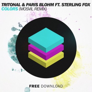
The ‘Chill House’ producer Mosvil describes himself as ‘a Swiss electronic music producer looking for his place in society’. The project’s philosophy is to make a step out of the usual 128 sounds of EDM and redefine Progressive sounds at a lower BPM. The logo therefore draws its inspiration from the three RBG layers used to symbolize this entire separation and redefinition. And the cover design keeps some familiar elements from the biggest labels in the industry, ending up in a conventional visual identity defining the new state of Progressive sounds, called ‘Chill House’. Here is the result (from the newest to the oldest).

04 Tri Martolod1 03 Alors On Danse1
02 Summertime1 01 Colors1

More about Mosvil
Facebook — Twitter — SoundCloud